Do the Cure Kick ASS? Yes, yes they do.
Just in time for Robert's birthday
Just in time for the 201st episode of South Park (with Robert Smith!)
Just in time to rock your socks off
Now you can get a limited edition high quality gloss vinyl sticker of my own personal homage to The Cure and Robert Smith's appearance on South Park. This design is my own drawing of the Cure as they would appear as South Park characters.
Look closely and you'll see just how finely detailed this drawing is, from the design on Porl's guitar to the stickers on Robert's guitar, to Simon's forearm tattoo, this artwork was drawn by a true Cure fan. The sticker is 3" x 4" and was created with silkscreen ink on a very high quality UV laminated outdoor glossy vinyl so it will live happily for years on your laptop, car or anywhere else you'd like it to be. You can see the difference in ink thickness on the photos below, these suckers will last and last without fading. Since I want these to last on MY car, I made sure to create only the best so that they will last for you too!
Plus, this sticker comes with a small "cell phone size 1" square" bonus sticker featuring my "Robert is my Homeboy" design!
The stickers are 3.99 each and shipping in the USA is only .75. Shipping internationally is 1.50. These prices are for up to 2 stickers, if you want more than this, please email me at curehalo@gmail.com and I can give you the pricing.
Thursday, April 22, 2010
The Cure Kick Ass Stickers!


Monday, April 27, 2009
Other Voices - Signed, sealed & delivered!
Those of you that have been watching the updates on Chain of Flowers know that the book was delivered to the band in Vegas. Here is the "official" story of the how and why and when, as well as the extenuating circumstances surrounding it.
When Friday, April 17th, 2009 dawned in Las Vegas, Nevada, those of us who were there for the concert were full of optimism that it would be a very special night, indeed.  The Cure were in town for an intimate show at the Pearl Theater, and many CoF peeps had gathered from all corners of the globe. We spent the afternoon at the casino in front of the box office, socializing and pretending to gamble. I received two last-minute pages at the casino and took over the concierge desk at the Palms so that I could put them in the album and make sure that the book was in top form before giving it to the Cure.
Returning to the "line" near the box office, several people had asked to see the book, and so we pulled up some chairs and went through the book several times so that people could see their pages and the cover and other decorations.  Many people commented on how much better the artwork pages looked in person, and I agree, it was hard to capture the real beauty of the pages of the book in photos, and I hope that can assure all of the contributors that the band will be very impressed at all of your dedication, all of the love you have for the Cure and their music was very evident in the pages that you sent in.
Many fans who were waiting at the box office got to meet Simon at one of the nearby bars, and if I had only known how the night was to end, I would have given the book to Simon, as I was one of the first fans to approach him that afternoon. Hindsight, as they say...
When the concert began, I had at least three separate avenues lined up to be able to connect with the band prior to or following the show, but as we all know, the concert did not end as expected. When the lights went up after "A Forest", I had a strong feeling that I should try to give it to them that night, in case something went wrong and they canceled their Coachella appearance. We weren't sure quite why the concert had ended early, and when the setlist with the encores on it was given out to those in the crowd, it confirmed to us that there was something going on. There was a lot of speculation that night about just what had happened, but in the heat of the moment, all that mattered to me was that it was my one chance that I was certain of to make sure that people that I trusted were able to take the book from me and deliver it to the band. So I handed it to Darren (Simon's guitar tech) as he was onstage breaking down the equipment, and he promised me at that time that he would give it to them. I confirmed through my contacts that the Cure were not receiving visitors backstage following the show at the Pearl.
When we were at Coachella on Sunday, I approached Darren after the show to confirm that they received it, and he assured me that he would give it to them at the soonest possible time. One of my contacts had also emailed a person connected to the band who confirmed on Monday morning that it had been given to Robert and the band. My original plan was to try to get a photo of the band with the book, but as we know now, Robert had injured himself at the Pearl, and it was not possible to do so.
So, will Robert or the band acknowledge the project somehow? Of course we would love him to do so, but most likely, he will not. Their own 30th anniversary celebrations must be getting underway, and of course with an injured hand he cannot type very well, so I think that we can be happy knowing that they have gotten it safely and that our messages have been signed, sealed and delivered. However, if I DO hear anything, I will be sure to let you all know!
Thank you again to all of the contributors and supporters for being a part of this amazing project. I am still doing the hard copy of the book and I will be announcing that here when they are ready to order, they will be available very soon.
P. S. - If you haven't yet heard the interviews with myself and Vicky, one of the contributors to the book on Studio Brussel, you can read about that here and also listen to the archived interviews. We were interviewed about the book and I was also asked about the Cure's set at Coachella.
Photo 1 courtesy of Caterpillargirl2
Photo 2 courtesy of Barb / Thistle
Photo 3 courtesy of Faithdesired
Saturday, November 8, 2008
Nightmare Shirts In Stock
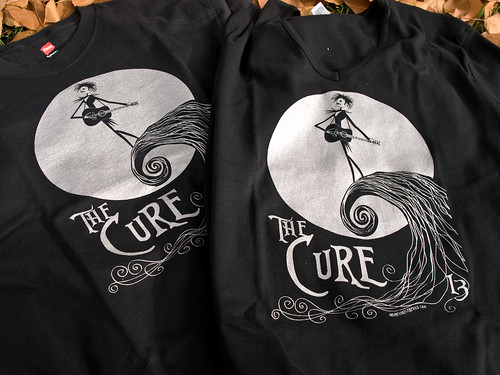
Despite a minor delay, the 2nd printing is now complete! I have to mention that the new screenprinter did a kick-ass job, and the new shirts are even better than the first ones. The ink is thicker and more sparkly, and the edges are crisp and clean. So despite the setbacks, I think that they will be worth the wait!
There are a few shirts
Tuesday, October 7, 2008
Nightmare before Cure-mas - Reloaded!

Ladies V-Neck photo by halo969
Sorry, these are out of stock at the moment!
Primary Colors of the Cure - Part 2
I hope that you enjoyed reading Part 1 of my short exploration of the colors in the Cure's song lyrics.
Following that train of thought, it seemed to me to be only natural to explore the color palettes presented by the studio albums. As we saw in the first part of this series, color is used to add meaning and emotional impact to the songs themselves. I think it is interesting how an album cover can also be distilled into distinct color palettes which can give us clues as to the overall emotional content of the songs in a particular album. For this blog post I used the color palette tool on the Colour Lovers website which is a lot of fun if you are artistically / creatively inclined and enjoy playing with color.
Here are all of the 13 studio albums as color palettes, along with an image of the album cover itself and a brief commentary on each one.
1. Three Imaginary Boys

Although Robert famously hated the cover artwork for their first album, the visual depiction of the band members as a lamp, a refrigerator and a vacuum cleaner (a hoover) is a now-iconic piece of 80's album art. Produced by the record company, the cover of Three Imaginary Boys was such an irritant to him that Robert insisted on complete creative control over the final product on all future albums.
2. Seventeen Seconds

As noted above, the cover of Seventeen Seconds was the first album cover personally overseen by Robert Smith, and the contrast between the first and second album covers could not be more striking. As the first entry in what would become the three darkest albums of The Cure's early years, Seventeen Second's cover provides a view into the new sound of The Cure after the disjointed pop of Three Imaginary Boys, The stark, minimalist expanse of white is broken by a blur of eerie tree branches and grey, undefined shapes. The splash of red on the lower left corner hints at a surge of emotion coloring the otherwise bleak landscape, and the frenetic lines suggest movement, which is fitting as the Cure's first charting single in the UK, "A Forest" came from this album.
3. Faith

Based on a photograph of the 12th-century ruins of Bolton Abbey in the fog, the moody atmosphere of the cover of Faith presents an even bleaker landscape than that on the cover of Seventeen Seconds. The second of the three dark albums, it offers little respite from the mood previously set into place. Here there is dim light, shades of gray and very little texture, broken only by the small logo and unadorned text near the top left. The brooding hulk of Bolton Abbey towers ominously above the viewer who appears to be lying on the colorless grass at the bottom of the cover. The emotional resonance of this cover is intense, oppressive and more than a little claustrophobic, perfectly expressing the music within.
4. Pornography

The final album of the three dark albums and the first in the later "Trilogy" series, Pornography takes the bleak landscape of Seventeen Seconds, and the despair and hopelessness of Faith and channels them both into a dark swirl of anger, hatred, death, lust and cynical passion. The sighs of gray on the cover of Faith have been replaced by bloodcurdling howls of red and purple, and the pale, distorted faces appear to arise from the black depths of a particularly gruesome nightmare. The narrow, unadorned text at the very top nearly fades into obscurity with its thin, stretched lines. This is the first album cover to feature the faces of the band members, and the only one to feature members other than Robert Smith on the cover. Notably, the three albums which do feature Robert Smith on the cover (Pornography, Disintegration and Bloodflowers) are all considered by fans and critics alike to be the best work of the Cure's extensive catalog, and were the focus of 2002's "Trilogy" DVD in which all three albums were played in concert back-to-back.
5. The Top

After exploring the oppressive darkness of the last three albums, coming across the artwork for The Top feels a little like stumbling into a circus sideshow tent just after visiting the Holocaust Memorial. Many fans of the era were reported to be furious at Robert for abandoning music influenced by the somber introspection that he had been immersed in. Understandably, there should be some confusion about how and why the man who wrote the line "It doesn't matter if we all die" suddenly began to cuddle kittens and sing about caterpillars! The sudden change in mood and atmosphere is vividly reflected in the cover art for The Top, with it's poppy, psychedelically optimistic tones of yellow, red, blue, green and gold. The emerald-green font of the album title takes up most of the front cover, another departure from the previous covers, with The Cure written in gold and larger than on any other cover previously published. The loopily introspective music on The Top is reflected in the bright jewel-toned colors of the album cover as we explore what is the closest thing to a Robert Smith "solo" album that has been published to date.
6. The Head on the Door

A more subdued palette greets us on the cover art for The Head on the Door . Fluttering, indistinct shapes in pastel yellows and pinks arise from a sea of black, overlaid by blue text full of curlicues and organic shapes. Although this color palette is toned down as compared to The Top, the surreal psychedelia of the songs on the album is still well represented by both the colors and shapes on the cover. The claustrophobic pop anthems of The Head on the Door take the hint of absurdity found in the music of The Top and add a hit or two of ecstasy, the swirling guitars of Porl Thompson and an undeniable pop sensibility to produce some of the Cure's first major US hits.
7. Kiss Me, Kiss Me, Kiss Me

With vivid red lips illustrating the album title, the colors of Kiss Me, Kiss Me, Kiss Me show us a more mature intensity that is less concerned with anger than with lust and love. The fiery reds and oranges of the cover invoke the heat of coupling, the desires of the flesh and the joys of union. Many of the tracks on KMKMKM explore themes of relationships and the conflict therein, and this is expressed in both the album artwork and color palette. The happy-go-lucky lyrics of the pop gems on The Head on the Door are gone, and in their place is a furnace of sexual energy and an abundance of sophisticated intellect. Meticulously crafted love songs and catchy pop masterpieces dominate the offerings of this, their 7th studio album. This album was the one that put the Cure on the radar of mainstream music with "Hot, Hot, Hot", "Why Can't I Be You" and "Just Like Heaven" pouring out of radios and onto club floors worldwide. Here the Cure are on fire, and it shows in the colors!
8. Disintegration

Once the fiery flames of KMKMKM had subsided, Robert decided to douse the lingering embers with the deep green waters of his own nightmares, and the result was Disintegration. Famously condemmned by the record company as commercial suicide following such an upbeat, passionate musical journey as KMKMKM, Disintegration proved that the fans were ready and willing to follow Robert into the depths of his own psyche. Here the album cover of the second installment in the "Trilogy" provides yet another visual glimpse into the watery, emotional heart of the Cure. The dark green depths of the cover are broken by shadowy, silhouetted flowers and a hauntingly pale gaze upward. The psychedelia here is less concerned with colorful eye-candy than with the veiled, introspective gaze which explores the shadows of the heart. The only counterpoint to the deep and pale greens here on the cover of Disintegration is a touch of brown which could even represent the viewer grasping for a place to stand while sinking into the dark.
9. Wish

Back on dry land once more, a surge of happiness suffuses the cover of Wish like a breath of fresh air from the circle of blue sky on the cover. One of the most commercially successful Cure records after Disintegration, the lyrics and music of Wish present a vision of the day breaking after the gloomy depths of midnight have passed. The colors on the cover present a happier Cure, with optimistic blue skies and white fluffy clouds surrounded by bright reds and oranges. The strangely compelling, iconic artwork by Parched Art draws us into an exploration of the meaning and imagery of the album cover and promises an optimistic view of love and life. Uniquely, the cover of Wish seems to have inspired more Cure tattoos than any other album artwork. From the commercial hits "High" and "Friday I'm In Love" to the lush promise of "To Wish Impossible Things" and the epic masterpiece "From the Edge of the Deep Green Sea", the Cure is in love, and so are we.
10. Wild Mood Swings

Fittingly, the cover of Wild Mood Swings features a windup clown toy, because this album represents the Cure at their most playful. The bright primary colors of the cover reveal songs which are very much mood swings, alternately coy and condescending, playfully erotic and heartbreakingly sincere. This album features some of the happiest Cure lyrics ever written, and some of the most underrated songs of their oeuvre. From the "gorgeous strawberry kiss" of red to the honey-colored yellow and tender-hearted blue, the clues to the moods of Wild Mood Swings are written in bright tones throughout the album and the cover.
11. Bloodflowers

As the self-described third part of the Cure's career-spanning "Trilogy" of albums, the cover of Bloodflowers is a near-explicit echo of the bleak understatement of the cover of Seventeen Seconds. Here we see the stark whites and blood reds, the dense blues and greys of that cover, but portrayed with much more intensity and depth. The mariachi band of Wild Mood Swings has decamped and the paper streamers from last night's party are but pale tatters fraying in the wind. Here the colors of the foreboding winter moon has brought us through the night to dawn and we understand that with age brings wisdom as well as bitter realization. On the cover of Bloodflowers, we return to the pale forest of Seventeen Seconds and Faith, but have brought both a compass and a friend along, so that this time, the journey is not nearly as lonely or as disorienting.
12. The Cure

Perhaps remembering the incoherent nightmares of his own childhood, for the cover of the Cure's self-titled 2004 album, Robert asked his numerous nieces and nephews to draw pictures for him and then compiled them into the artwork for The Cure. The resulting effect takes all of the unspoken night terrors of pre-adolescence and distills them into a creepily subdued palette. The muddied colors evoke the fear of that spooky old mansion down the street, the yellow color of the wash of light from the porch light and the purple shadows lurking in the yard after midnight. The colors and disconnected childish cartoons of the cover let us know what to expect, and what not to expect from the Cure's 12th studio offering.
13. 4:13 Dream

Returning once again to the Parched Art aesthetic which was missing from Cure covers for 16 years, the cover of the forthcoming album 4:13 Dream is sprinkled with effervescently optimistic colors which highlight the shadowy shapes and hand-sewn detail of the watercolors on the front of 4:13 Dream. Bright flashes and splatters of yellow, pink and blue surround the hypnotically glowing red eyes of the central mask-like figure which echoes the pale faces of the cover of Pornography. The stars invoke the much-anticipated opener "Underneath the Stars" and the surreal, dreamlike shapes bring to mind the hallucinatory lyrics of the new singles "Freakshow" and "Sleep When I'm Dead".
As with many other Cure albums such as Wish and Wild Mood Swings, the themes of the main album are repeated and expanded upon on the covers of the singles, creating a coherent and immediately recognizable visual theme, which is reinforced through use of color and style. Here, the overall effect is one of entering a bright daydream where the echoes of the past Cure albums reverberate, informing and infusing the new works with the spirit of the old.
A Final Note:
It was while writing this article that I first noticed that the three "Trilogy" albums are the only ones to feature Robert's face on the cover (albeit more abstractly with Pornography) and thought that it was interesting that they are the ones which Robert Smith considers to be the most representative Cure albums. Certainly others have noticed and remarked on this phenomenon before, however it was not something which I had thought about before doing this analysis of the album covers. It definitely made me wonder more about the process that they go through to produce the covers, and whether Robert's confidence in the material is what inspires him to put his face out there on the album, or whether that has even been a conscious decision on his part. If you have any insight into this process, please leave a comment or message, I'd love to hear from you!
Monday, July 28, 2008
The secret language of Cure tattoos

The topics are interconnected in that the reasons that people get Cure tattoos based on the album/single/other artwork are extraordinarily varied, however many people feel that the artwork of any given album is an integral part of the experience of Cure records, and may even be the reason that even now, in the digital age, fans of the Cure tend to buy the actual physical records, often in addition to downloaded MP3s.
For instance, note the recent entry of the latest Cure single, released on July 13th, Sleep When I'm Dead, which debuted on the Billboard Hot Singles sales list at #1, even above Madonna's newest song, which debuted at #4. This, despite an almost complete lack of radio play in America! How are we (or the band) supposed to reconcile this extreme disparity?

My personal theory behind this phenomenon is that it has to do not only with the lengthy success of the Cure as a band, but also has much to do with the idea that Cure fans know that when buying a physical record (CD or vinyl), they will be participating in the full experience of the music. When the Cure release an item, they normally do not skimp on the details of the packaging, with artwork, pictures and song lyrics often included. For instance, on the recent series of remasters, the double-cd set could easily have been released in a simple double-cd jewel case with front and back artwork. It would have been simpler and certainly much less expensive than to produce a full-color fold-out CD box with cover and 20-page illustrated booklet with photos. However, they did not skimp, and we are treated to a mini-history of the Cure along with each remastered album.
Pre-digital?
During the Cure's early years, given the lack of instant-on communication and lightning speed information that the internet currently offers, the artwork which came with a particular album offered a visual and visceral glimpse into the music, and the process of creating it. Given that much of the early artwork was actually done by someone completely immersed in the creation of the music itself, it is little wonder that the art seems to "channel" the emotions and mood of a particular album or single into a distinct and coherent whole. This is reinforced by the creation of fonts or lettering, specific icons and visual styles that went along with each studio album.
For many people who were first introduced to the Cure in the pre-digital era, listening to an album for the first time was a cherished ritual that included sitting in front of an actual record player (or cassette player, depending) carefully slitting the outer wrap open, and perusing the album art intently while listening, and perhaps even reading the words along (after the initial listening session) until they had been learned by heart. One might even try to make sense of the way that things in the album art were put together, or reused for different purposes on the singles. For instance, the instantly-recognizable and yet eternally ambiguous bird-fish which graced the cover of Wish only as line-art, and yet became the main symbol on the cover of High, when it was released as a 12" single. In the pre-digital era, this artwork was a form of communication between the band and its fans, many of whom read it eagerly, as if it were a set of important hieroglyphics needing to be decoded and translated.
The Tattoo
For Cure fans, the reasons for choosing a specific tattoo are as unique as each individual being inked, however, very often the choice is linked to a specific album or it's artwork in some way. For instance, on the Chain of Flowers Tattoo Gallery, there seems to be a high percentage of tattoos which reflect the Wish-era artwork, particularly the nearly-abstract rendering of the word CURE, along with the aforementioned bird-fish, which are often seen together in some way. There are also a few renderings of the eye from the Friday I'm In Love single, however they are without the surrounding heart full of clouds. Many people consider Wish to be one of the Cure's most immediately accessible albums, and the preponderance of tattoos from this album artwork may bear that theory out.
Another factor likely contributing to the high incidence of Wish-era symbolism in tattoos is the high availability of recognizable iconography from that album. Some album artwork is more difficult to distill into tattoo form, most notably, the photo of the smeared lips from front cover of Kiss Me, Kiss Me, Kiss Me - however some fans use the font style from that cover to embellish their bodies with words, instead of trying to reproduce the picture. Other album covers which are relatively rare in tattoo form include the soft, out of focus photographs from the covers of Faith and Seventeen Seconds (although there are tattoos inspired by both of these albums). The severely lined face of John Button from the cover of Standing on a Beach and the frenetically-blurred hands on The Head on the Door are likely also more difficult to render in ink on skin, however some single artwork of the same era - such as Quadpus and the silhouette from Boys Don't Cry are both popular. Also, despite its chart popularity and masterpiece status, I have yet to see a tattoo of the cover of Disintegration.
There are also fans who sport inked portraits of Robert Smith, whether more straightforward or more abstract, and some who have one completely unique to them alone, and there are even a lucky few who have had Robert Smith and the other band members use their skin as a canvas. There are even some individuals who can't decide on just one Cure tattoo!
Cure tattoos can even be viewed as being a secret language between fans, with some of the lesser-known designs and fonts being known only to people who have ardently collected and enjoyed the Cure's music over the years. Having a tattoo that proclaims your love for the band unequivocally is fine, and many people do include the band's name somewhere in their design. However, I have noticed that there are many tattoos which are composed of song lyrics, or a symbol or design, and in most cases, these would be unrecognizable to more casual fans or the mainstream public as a Cure tattoo without further explanation from the wearer. A visible tattoo of a symbol or text that is recognizable mainly to other Cure fans can be a way of finding others who share a similar level of passion about the subject and love for the Cure and their music.
The choice of tattoo can even give other fans important clues regarding your interest in the Cure.
A friend of mine calls tattoos "our own personal bumper stickers", and in this respect I believe that is a very accurate assessment, particularly given the unique mood of each album. A knowledgeable fan would be able to understand more about the person simply given the content of the tattoo. A Cure tattoo provides a common ground of interest, and almost provides an instant feeling of camaraderie. For instance, if I saw someone with a Cure tattoo in a coffee shop or airport, I wouldn't hesitate to strike up a conversation. Robert once mentioned that Cure fans dressing in a certain way or wearing similar makeup was a way for Cure fans to recognize one another, and my belief is that the Cure tattoo is the modern equivalent to this, as many of the Cure's fans have aged somewhat and are no longer as apt to wear the interesting clothing or heavy makeup every day.
Symbolism
While some tattoo wearers may have chosen a specific album style or design because it resonates with some important time or theme in their lives, there may be some who have gone deeper into the underlying symbolism of some of the artwork, and chosen it based on the symbolism as well. One symbol which seems to resonate with fans as a tattoo is the cover artwork for the single version of Lovesong. The song is widely known to have been written as a wedding present from Robert to Mary, but many fans also know that the cover artwork for the single is an abstract painting done by Robert of himself and Mary, showing their faces merging. With the combination of the meaning of music, song lyrics and the painting, a tattoo of this design could symbolize a powerful belief in enduring romantic love, such as that between Robert and Mary, who are arguably, one of the most long-married couples in modern rock history. With their 20th wedding anniversary coming up in August 2008, and having been previously together for 15 years before the wedding took place, this means that they have been a couple for nearly 35 years in total. So that particular symbol can be a very meaningful tattoo as an affirmation of the wearer's belief in long-term love or their relationship with their significant other.
In my particular case, I chose two symbols which have deeper meaning to me than simply the surface meaning of being part of the album artwork. Firstly, I will talk about the heart with an eye in it from the cover of the Friday I'm In Love 12" single. Musically speaking, although I love the A-side song, the B-side of Halo is the perfect Cure love song, and I have always enjoyed it as such. The cover artwork of the heart-shaped sky with an eye in the center is very impactful and iconic, with meaning resonating throughout the design. The most important thing to me, though, is that this design neatly represents the concept of seeing the world through my heart. The ideal of treating others with love and compassion is central to the way I try to live, and the image of the heart composed of blue sky and white clouds can be seen to represent the world and the universe beyond it, encompassing "all sentient beings" as the Buddha would say.
The eye with the moon in the center also represents being able to delve into the depths of consciousness, as the moon has long been associated with the mysteries of human emotional life, as it waxes and wanes throughout each month. The moon in the center of the eye is the waning moon, which has been balanced by the inclusion of a waxing moon symbol above the main design. The full circle of The Top logo can also be used to symbolize the full moon, so that all three aspects are included in the final design.
The circular "logo" from The Top album is included for several reasons, including that just mentioned. It was the first Cure album that I ever purchased, so it served as my introduction to their music, after the single "Lovecats" (which was the first song that I ever heard). The logo resembles Egyptian hieroglyphics and circular seals of the pre-dynastic period, which is also a personal interest. The inclusion of the bird is important to me as my own spiritual path has been very associated with different types of birds as totem animal guides. The snake is an icon of sex, death, regeneration, the powers of prophecy and a symbol of the Goddess. The stars in the final version speak of my interest in astrology and astronomy as well as relating to several Cure songs which are personal favorites, particularly the yet-to-be-released song, Underneath The Stars. So from the beginning of my love affair with the Cure, up to and including my most recent experiences with the band, this tattoo encompasses 26 years of their music and artwork being woven throughout my life.
Regardless of the reason for getting it, a tattoo is a deeply personal and intimate decision, and it is obvious that the symbolism of the album artwork resonates deeply with individuals worldwide. I am of the opinion that the more meaning a tattoo has to the wearer, the more satisfied that individual will be with it on a long-term basis. Regardless of the person's motivation, it is clear to me that Cure fans are deeply passionate about the band and their music, and some of us are even willing to literally wear our hearts on our sleeves.
Update: I've had some questions about my statement that Robert painted the lovesong single cover. The single artwork credits Maya for the artwork, butI had previously read somewhere that Robert had experimented with painting and had produced the a self-portrait with Mary for the album. Although I have researched it a little, I have not been able to find a source for this idea, so I hereby retract that statement. Thanks!
Monday, June 30, 2008
The Cure Kick ASS!
 New! I have added a flickr set with some closeup and detailed photos of the design as it is printed! I have also added a photo of the teeshirt style that they are actually printed on. Check out the Cure Kick Ass! Teeshirt set here!
I finally got my stuff together and set up a paypal for my shirts! This design has it's origins when, several years ago, I wanted a teeshirt with the Robert Smith character from South Park on it. I couldn't find one to buy, so I made my own. Then a friend wanted Simon done, so I made some Simon ones. Then I got the idea that I wanted to do the whole band, and then give the band a teeshirt for each one of them. I'm happy to say that I was able to give them the shirts in Sunrise, FL (although I didn't toss them onstage, I was afraid they would get dirty or stepped on, so I gave them to their head of security.) So, many people have asked me for one, so I set up my paypal account to sell them. Now, I am selling them, but believe me, it's more a labor of love than anything else. I am NOT making scads of money on these, with the cost of teeshirts, shipping, ink and time. Not to mention how long it took me to draw the characters! So with the amount of time each one takes, I probably end up with about $3 overhead on each one, so they are only offered to fellow hardcore Cure fans and probably for a pretty limited time.
Teeshirt Q & A - Why digital printing? - Teeshirt Care Tips
I've gotten lots of questions and lots of feedback on this page, and so I've changed
a few things around to offer more options to people wanting these. Please change the quantity after you click the button if you'd like to order more than one.
FINALLY! I figured out the shipping costs to be much more accurate. Most of the shipping charges have gone down, and now I am shipping exclusively through the USPS, since they are much less expensive than the private services. Here are the new options, these prices are for shipping 1-2 SM-XL .shirts only. XXL and XXXL can only be shipped one per envelope, so if you order multiples of these shirts, I will contact you for shipping options.
US Priority - ships anywhere in continental US in 2-3 days - $5
US Express - ships anywhere in continental US 1-2 days - $16
International Priority - ships to most of Europe in 3-7 days - $13
International Express - ships to most of Europe in 2-5 days - $26


